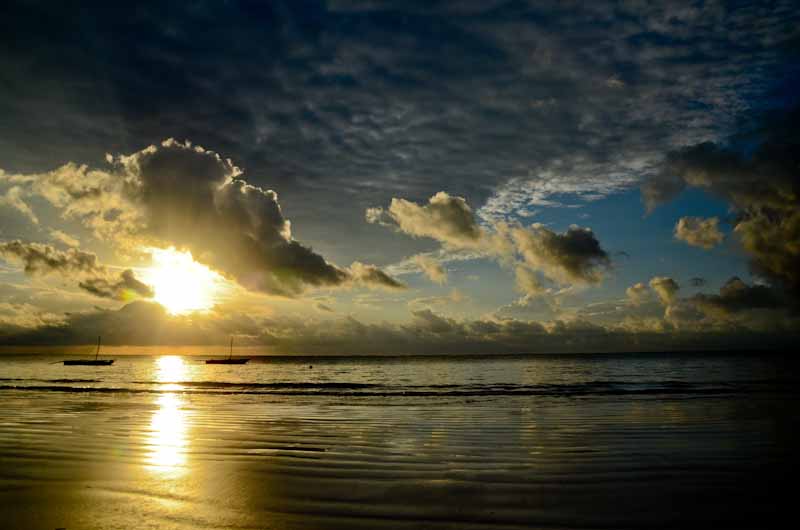
For me the horizon is too centered in this image. Looking at this shot the story to me is more about the sky so I would lower the horizon and place the sun in a rule of thirds intersection.


This shot needs something dramatic. Right now it is just a picture of some steps. I think you could get down at a lower angle and shoot this at a more dramatic perspective or add something on the steps. I cropped your image so you couldn't tell what was at the top of the steps and darkened everything but the bottom of the steps. It gives a little drama of the unknown but I think it really needs something added.


I don't think it works to chop off part of the flower in this one. Other than that I think it is a nice shot.


Very contrasty lighting and a lot of dead space on the right side of the frame. I darkened the rest of the image to put the spotlight back on the lizard where it belongs. I cropped to bring the focus on the lizard. (ROT)
I do like the original crop in a quirky way but there is WAY too much darkness at the top of the image for me. I also sharpened the lizards head and kicked up the contrast a little.
I do like the original crop in a quirky way but there is WAY too much darkness at the top of the image for me. I also sharpened the lizards head and kicked up the contrast a little.


This is a really nice shot. All I did was kick up the contrast a little, added a little sharpening and cropped the fly out of the center of the frame. (The sharp area, the head, is now in a ROT intersection)

No comments:
Post a Comment